Thursday, 24 March 2016

Statement to Manchester School of Architecture

The Manchester School of Architecture (MSA) is an honourable educational institute recognised on a global scale by the most respected faces in the architecture industry. Geographically, MSA's location is ideal for me as it close to home and near family, which with my condition is vital. MSA has all the capabilities to help me achieve my long term goal of maximising my potential, in terms of my profession this is to become a leading and stylistic architect.
Through Robert Venturi's book, Complexity and Contradiction in Architecture, I have learnt that contradictions in architecture, if used correctly lead unlimited potential. My eyes became open to this concept whilst in Japan. I visited the National Museum of Modern Art. The building's function was to contain art however, to me it was the most effective and immersive art piece. It utilises straight lines, leading the viewer's eyes to a specific focal point. Additionally, the museum is filled with curvatures which are easy on the eyes and somewhat hypnotic. This makes the museum a perfect example of Venturi's concept, with its regal, tall ceilings and a mixture of linear and curved lines it stands strong. It is art, it is contradictory and most notably, it is magnificent.
Rome, the modern home to ancient architecture. Rome's most famous structure is unarguably the legendary Colleseum, however in my eyes the fame should shine more on the Pantheon. The almost 45 meter ceiling of the Pantheon towers over those inside. At the peak of the dome sits 'The Eye of The Pantheon', a hole 8 meters in diameter. This may seem like an issue, as it would allow rain to penetrate the structure, however Apollodorus' designs meant that when candles are lit around the circumference of the circular interior the collective heat of the candle flames vaporises the incoming rain. The Pantheon beaming with individuality as a single floor structure; powerful with its raised spherical ceiling which represents the divinity of the Gods. The Pantheon is truly a love letter to physics and art and due to this it remains a revered architectural marvel nearly 2000 years after its construction.

Venturi's book has taught me a lot, but most importantly it brought Le Corbruiser's genius to my attention. My first sight of his Shodhan House left me confused, then with mixed emotions and finally it left me astonished. It is a perfect cube, closed by its corners yet open in seemingly random areas. It was this contrast between symmetry and choas that lead to my initial confusion. The high praise by Venturi and Paul Sheppard force me to believe that it is a magnificent structure which makes me desire to view it in real life

City Scale Sketch - Gothic Russia


City Scale Sketch:
My Original Design.
Inspired by both Russian Architecture and Gothic Architecture.

Creation Process:
I used extremely basic tools to create this; a pencil, a ruler and some cotton swabs.
I love Gothic architecture due to it's character, it stays true to it's nature, which I feel is part of it's success and popularity across the ages. This interest in Gothic Architecture influenced my thoughts and design when creating this city. I even tried to even go a step farther, as often examples of Gothic architecture are isolated buildings or are surrounded by the modern world, and thus the captivating aura that surrounds the structures is not very expansive. I felt that if I managed to create a city densely packed with Gothic style buildings it would create a scene with an overwhelming atmosphere.

Cuboctahedron shape - Adobe Illustrator

A friend of mine in currently progressing with his undergraduate studies in architecture and taught me some basic Adobe Illustrator. With this I designed the netting, side view, top view and isometric view of a cuboctahedron.

Sketch - The Guiette House, Belgium.

Tools:
Pencil, Ruler, Rubber, Pencil Sharpenings

This is a quick sketch of mine of the Guiette House in Belgium. To me, the Guiette House is as close to Le Corbruiser's work as possible, without it being designed by Swiss architect. It is also very similar to Robert Venturi's Lieb House. I truly appreciate the simplicity of the design and its linear design fashion.

Fine Art

My recent focus in terms of art has primarily been in photography. Photography has undoubtedly changed the way my imagination works and what I produce when it comes to draw something imaginative. This drawing is a side way profile portrait of a man and a building coming out the back of his head; this is inspired by double exposure photography. There were multiple steps involved in this drawing, The first step was to draw a man, and with no actual living man in mind, I created my own. After this I wondered what form of architectural setting this man seemed most fitting with, and he seemed rather fitting with the spas in Bath (South West England).

Original House Design

One of my favourite architects is Le Corbusier, I truly enjoy his style and focus on 90 degree angles and squares. I wanted to replicate his style and so this house has a cubed outline. I did however want to develop this idea, and so the same way that Le Corbuiser included smaller squares in his Shodan House, I included smaller triangles in this house. I used triangles in this instead of squares because I didn't want to 'copy' the Shodan House, but I wanted to take inspiration from it (and the Lieb House). The triangles came into play due to their common use in modern Japanese architecture which truly caught my eye in my recent visit. The beauty of this is that triangles are basic polygons, just like squares. From this you can tell how great the impact of Le Corbuiser's architecture has influenced me. I took a concept from his Shodan house and reformulated it to get my desired result. The outcome of this is a design consisting only of basic polygons, trapeziums, squares and triangles.

Photography and Fine Art Photography


Interior - Original Design

This is my own design of a modern log cabin.
Log cabins usually have a very basic interior, which doesn't appeal to me. Log cabins do however, tend to display their roof support beams in the interior, which I find to be extremely appealing. I chose to redesign the standard log cabin due to it's stagnant development in the world of architecture. The primary focus of my design is the ceiling, as within the standard log cabin, that is the only element that truly intrigues me. My aim for this design was to bring something fresh and new to the log cabin, and so I my focus became to introduce features of modern architecture. The first thing I knew I wanted to implement into the cabin was glass, but this could only be a side feature as a log cabin should be primarily wood (hence 'log cabin'). But I had to find a way to implement glass as it is such a common feature in today's world of design, and so I did this using windows as they're functional and can create a glass feature. I also knew I wanted to include a some what complex geometric focus, and so I took it to the ceiling. As I previously mentioned I enjoy the visuals of the internal roof supports.

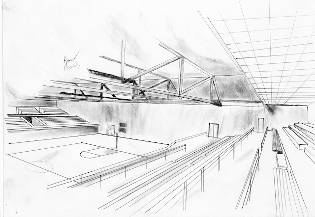
School Sports Hall Interior Design


Tools:
Pencil, Ruler, Rubber, Pencil Sharpenings
This was a quick sketch of a school sports hall.

My City Design - Eco City Skyline


Tools:
Writing Pencils, a ruler, a protractor, colour pencils and pencil sharpenings

The world is constantly attempting to become more environmentally friendly. In designing my own city I felt that it was only fitting to create an environmentally friendly city. This city is equip with wind turbines and open sky gardens on the far right building.

Sunday, 13 March 2016

Qatar's Museum of Islamic Art - Live Sketch

This sketch was drawn whilst at the Museum itself.
Tools: Writing Pencil, Blue pencil (done once I got home), Ruler, Rubber, Pencil Sharpenings
Why The Museum of Islamic Art?:
In terms of design the Museum of Islamic Art (MIA) is a marvel. It's geometric design makes it so that no matter what time of day, be it dawn, noon or dusk, shadows are present. It's angular nature ensures that light bounces (and becomes softer) from each surface and onto another, meaning that a gradation of shadow is present, rather than a harsh halt of light. This compliments what would be a bland tonal range of the building. At night, the building is lit with carefully placed, warm lamps. These lamps add a new dimension to the building in terms of colour, due to the fact that as the light falls off the building, the less saturated the colour of the building becomes.
To me, the building is a masterpiece. Within all of it's priceless art and artifacts, it still manages to remain as the primary exhibition piece. It makes no compromise on either form or function; it prioritizes both.


Friday, 11 March 2016

Icelandic Waterfalls - Free Hand 25 Minute Sketch

Free hand 25 minute sketch.
Icelandic Waterfall
Tools: Standard writing pencil, rubber, cotton swabs, pencil sharpenings
This drawing is of some of the Gjáin waterfalls in Iceland. There was no significant or specific reason as to why I chose these falls specifically other than the fact that they look pleasant.
These falls are an example of God's architecture, a manifest of tranquility and freedom. My drawings cannot do it justice, but the attempt was in awe and admiration.